 Freaky Font Fonts That Break the Rules
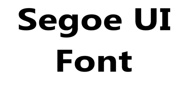
Segoe UI is a modern sans-serif typeface designed by Steve Matteson and serves as the default user-interface font across Microsoft products, including Windows, Office, and many applications.
Microsoft introduced Segoe UI with Windows Vista, and it quickly became a standard choice for digital and UI design. Its clean, highly legible letterforms perform exceptionally well on screens, whether on desktops, laptops, tablets, or mobile devices.

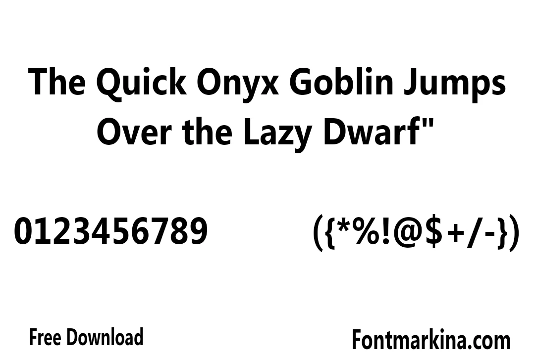
As part of the broader Segoe font family, Segoe UI focuses on readability. It uses open, neutral shapes that keep text clear and easy to read, even at small sizes.
Because of this clarity and simplicity, Segoe UI is popular among UI/UX designers, typographers, and web developers for use in digital interfaces, websites, corporate branding, and printed materials.
Usage of Segoe UI Font
It is a proprietary Microsoft font, so it isn’t freely downloadable or open-source like many Google Fonts. However, it is available through Adobe Fonts for users with supported plans.
Designers often use Segoe UI in tools like Adobe Photoshop, Illustrator, Figma, and Canva (where supported) or preview it through online texture generators and logo design tools to create styled text, UI mockups, and branding visuals.
Similar Fonts to Segoe UI Font
- Roboto Font
- Inter Font
- Open Sans Font
- Helvetica Neue Font
- Arial Font
- SF Pro Font
- Lato Font
- Noto Sans Font
- Source Sans Pro Font
- Myriad Pro Font
Font FAQs!
Is the Segoe UI texture free to download?
It is a proprietary Microsoft font and is not freely downloadable for commercial use outside Microsoft products.
Who designed the Segoe UI font?
It was designed by Steve Matteson for Microsoft.
Is the Segoe UI texture good for web and mobile design?
Yes. This texture is optimized for screen readability, making it ideal for web design, mobile apps, and user interfaces.