 Freaky Font Fonts That Break the Rules
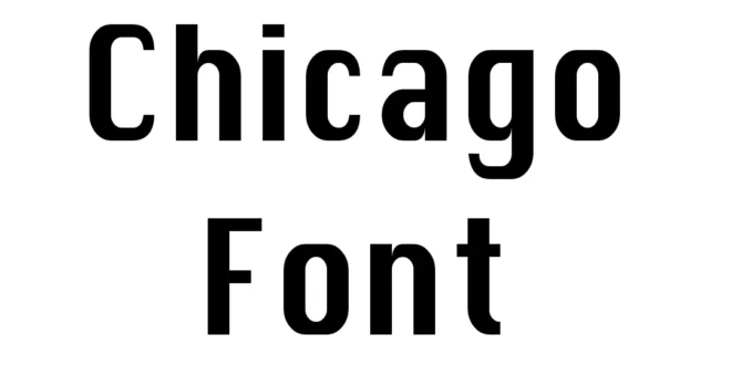
So today, let’s talk about the Chicago Font Free Download, where it came from, what makes it tick, and whether it actually works for modern designs (spoiler: it does, in some surprisingly fun ways).
This is one of those fonts that looks simple at a glance, but it has a whole story behind it.
Chicago was originally designed by Susan Kare, one of the most influential designers behind Apple’s early visual identity.
It was released around 1984 as part of the original Macintosh system fonts, basically before “system fonts” was even a formal category.
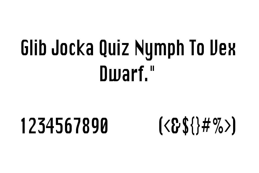

The typeface was produced by Apple Computer, Inc., functioning as the backbone of the Mac interface for years. The chunky, slightly off-beat spacing wasn’t a mistake; it was engineered so letters wouldn’t look mushy on tiny black-and-white screens.
Typographic Details (Weights, Styles, Formats, Characters)
Now, in the modern world, this texture isn’t limited to bitmap squares. The revived versions floating around the design community usually include:
Weights: Regular (most common), plus some fan-made Bold/Light versions
Styles: Upright only; Chicago was never meant to be fancy or script-like
Formats: TTF and OTF are the most widely shared today
Character Set: Basic Latin alphabet, numbers, punctuation, and some accented characters, depending on the version you download.
Where Chicago Actually Works in Real Life
I’ve seen designers use Chicago for:
- UI mockups meant to look like early Mac OS screens
- YouTube thumbnails for tech nostalgia channels
- Logo designs for indie apps trying to feel “retro-futuristic”.
- Print posters with a playful 80s Apple Shop aesthetic
One fun (and oddly effective) use case: labels on physical products. I once saw someone print ‘Chicago’ on a homemade synth panel, and it looked legit—like 1987 Apple had quietly made a drum machine.
Similar Fonts (With Honest Opinions)
1. Geneva font
Kind of Chicago’s cleaner, friendlier cousin. Less chunky, more “corporate Apple”. Great for headings.
2. Charcoal font
This was the system font for Mac OS 8/9. Smoother and more polished—but still has that DNA of early Apple.
3. San Francisco Display font (modern Apple)
Not truly similar, but fun to compare. It’s like seeing how Apple’s typography evolved from chunky pixels to sleek curves.
4. ChicagoFLF font
One of the most faithful recreations. Very close to the original bitmap charm.
FAQs—Let’s Clear Up Some Common Questions
Is the Chicago font really free?
Usually yes, but only the recreated versions. The original Apple bitmap Chicago isn’t openly licensed.
Can I use Chicago for a commercial project?
Only if the specific version you download allows commercial use. Some do, some don’t.
Does Chicago support non-English characters?
Mostly just the basics. A few versions add accents, but don’t expect full multilingual coverage.
Is Chicago good for long paragraphs of text?
Honestly? Not really. It’s great for titles, UI elements, and graphic design, but reading whole paragraphs in Chicago feels like browsing a 1986 instruction manual.
Why does Chicago look blocky?
Because it was designed for pixel-based Mac screens in the 80s. That blockiness is part of its original engineering.